


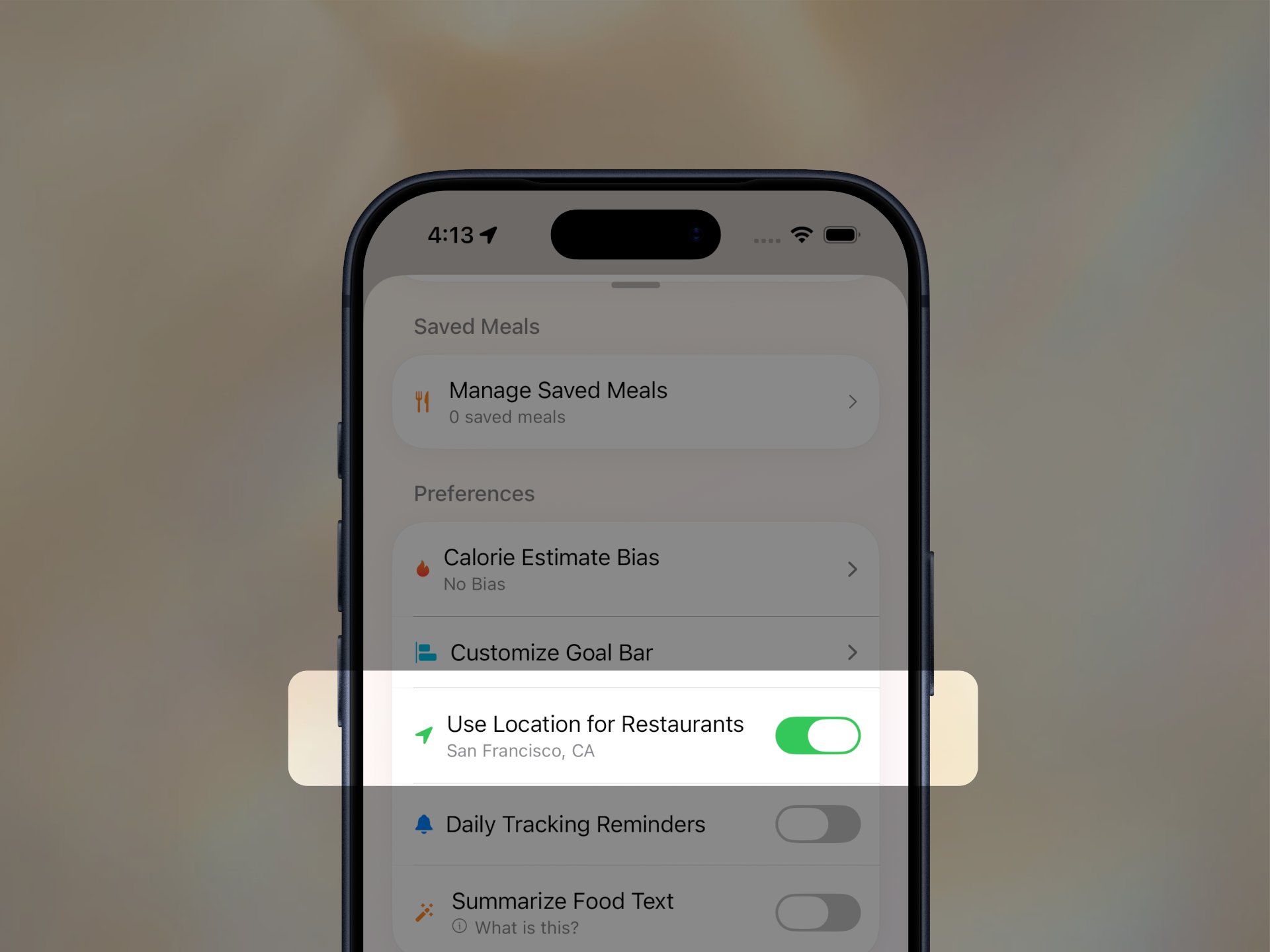
Imagine you’re sitting inside Goobne Chicken with your food in front of you and your phone in your hand.
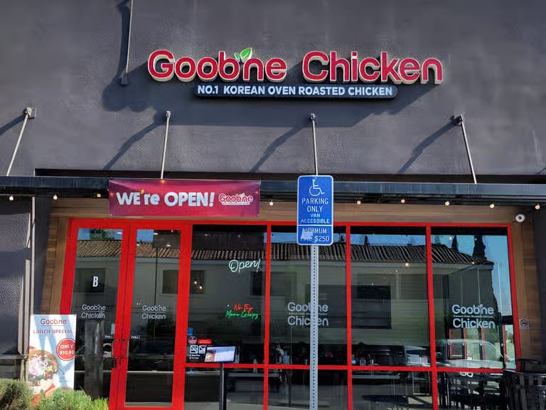
You open Amy, my calorie-tracking app, hold down the microphone, and say, “Two side dishes and Korean barbecue from Goobne.”
Somewhere in the middle of saying it, you have a quiet second thought: there’s absolutely no way it gets that.
An In-N-Out burger with fries is one thing. The words are common, and the restaurant name is familiar. Goobne is exactly the kind of name speech recognition can turn into something plausible and completely wrong. It might understand every other word in the order and still miss the one word that matters.
Then Amy just logs it. Goobne Chicken, spelled correctly, sitting in your food log like it was never in doubt.
The meal appears. No correction. No list asking which restaurant you meant. Nothing celebrates. It just works, and for a second you think: wait, how did it know that?
That little beat is the thing I’m chasing when I build.
People who build products talk constantly about “surprise and delight.” I’ve heard that phrase so many times it has almost stopped meaning anything. Usually it gets translated into confetti, a cute animation, or a clever empty state. I like those things. But building Amy has forced me to get more specific about what I actually mean: a moment that feels almost impossible to the person using the app.
Not flashy. Almost impossible.
So let me ruin the trick, because the reason that moment works is completely hidden.
When someone turns the feature on, Amy quietly looks up the restaurants around them when the app loads. It caches up to twenty nearby names, cleans them into keyterms, and sends those keyterms along with the audio when dictation happens. Goobne is no longer just a strange sound the system has to guess from scratch. It’s one of a short list of likely restaurant names nearby.
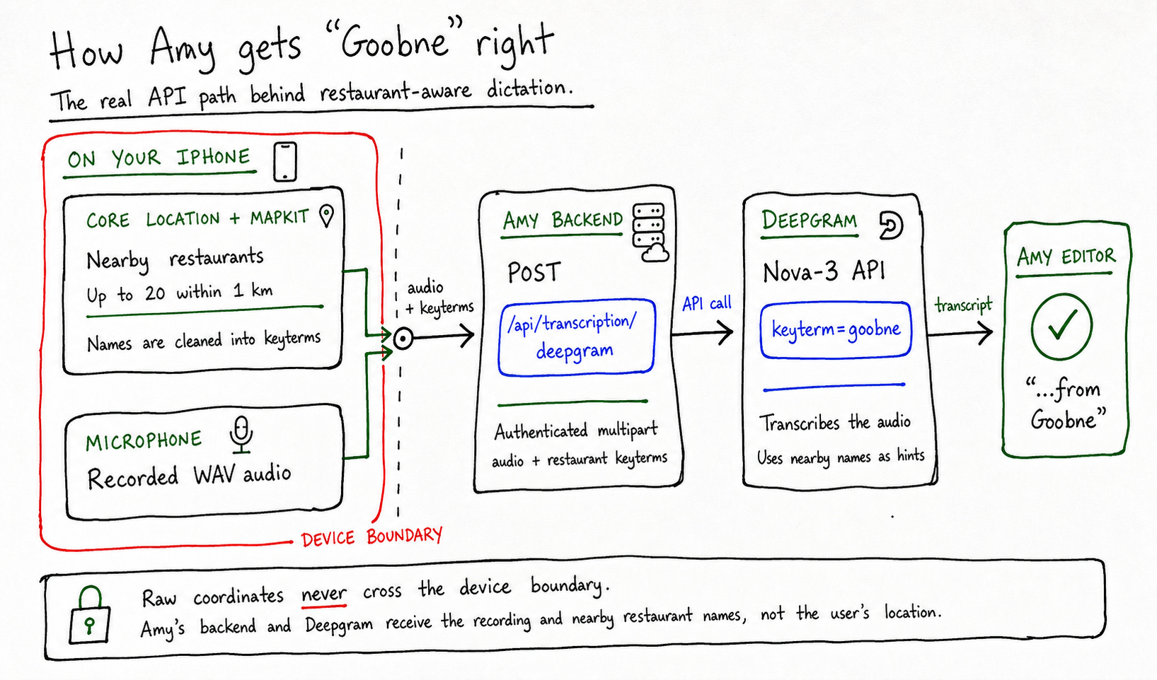
There’s no restaurant picker and no extra question. You say the order, Amy gets a better chance of understanding the difficult part, and you move on.
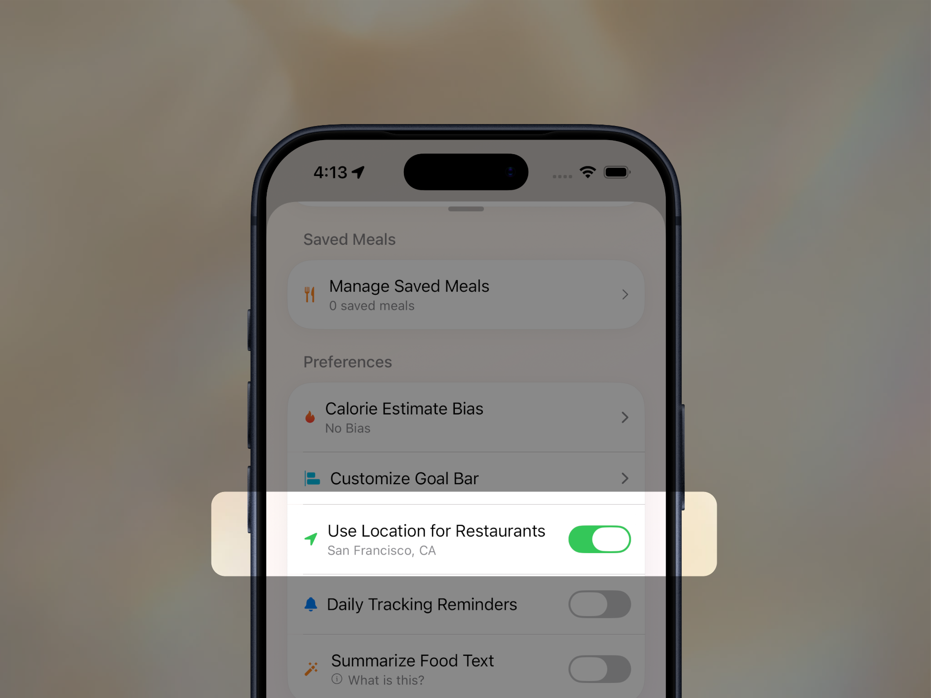
This feature is completely opt-in. It’s off by default. During onboarding, Amy explains why location helps and lets you choose whether to turn it on. Privacy was one of the first things I considered: Amy uses your location on-device to find nearby restaurants, but only the restaurant names are sent along as transcription hints. Your coordinates never leave the device.
I talked about this exact example in my video, How I Make Apps Feel Premium. I’ve started it at the restaurant section below.
This might be my favorite detail in Amy precisely because there’s almost nothing to show. Most product work is easy to point at. A new screen, a redesigned icon, a cleaner chart. You can put it in a screenshot and explain what changed.
This work disappears into the mistake that didn’t happen.
That’s what “surprise and delight” has started to mean to me. It isn’t necessarily an extra layer added after the real work is done. Sometimes it’s the invisible work that makes the obvious path succeed. The product does more thinking, so the person using it can do less.
If you’ve come across another “wait, how did it know that?” moment, let me know. I’m always looking for more examples like this.
Designs that inspire me
Every week, I’m going to share one or two interfaces that inspire me. I’m obsessed with designs that stop me from scrolling. Not because I love every part of them, but because there’s usually one idea inside them that I want to understand.
Dictation that feels like the default


This Monogram interaction caught my attention immediately. After the prompt is submitted, the words briefly bend and ripple as the interface gives way to the result. It’s a tiny transition, but it makes the whole surface feel unusually alive.
What I find most interesting is the keyboard button on the right. In the clip, the prompt is typed. But look at the hierarchy: the microphone is the big, obvious target, while the keyboard is a smaller control off to the side. Most apps do the opposite, with the keyboard first and dictation as the alternative. This layout suggests they expect you to speak. If you want to type, there’s still a dedicated button waiting for you.
I rarely see an app make the keyboard something you deliberately summon. It’s a small decision, but it says a lot about what the designers think the primary interaction should be.
The liquid treatment immediately reminded me of Wabi. I don’t know if that was actually the reference, but I like seeing that visual language on an interface that seems built around voice.
A background that becomes part of the subject
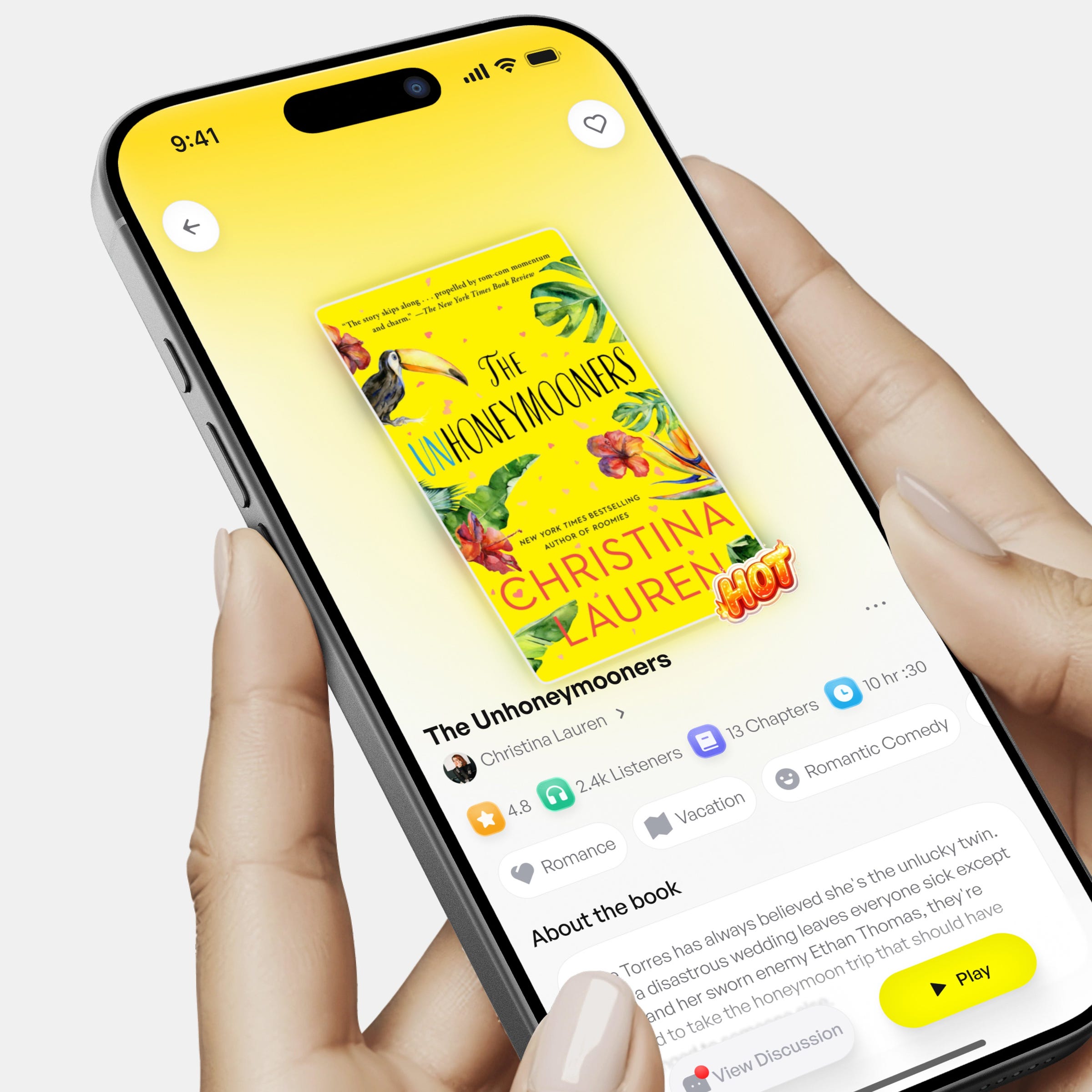
There’s a lot about this screen I don’t like, or at least haven’t made up my mind about. I’m going to ignore the bottom half entirely.
The top half, though, stopped me immediately.
The yellow gradient matches the book cover so well that the background feels like it’s coming out of the book itself. The book is still the focal point, but its color seems to spill into the rest of the screen. It makes the entire composition feel much more alive.
This is what I keep coming back to. The background is doing almost nothing structurally, yet the relationship between it and the book is powerful enough to stop the scroll. I’m increasingly interested in interfaces that borrow their atmosphere from the thing they’re framing.
Unfortunately, I don’t know where this image originally came from. I found it on Twitter, but I’m fairly sure the person who shared it found it somewhere else. If you know the original source, please email me so I can attribute it properly.